It’s kind of funny, but in a way what are we reading should be common sense; the people making the product and the experience should turn to the people buying the product. This idea is not that common, and some companies get lost in the corporate board lead consumer products. When an executive makes a choice for something without ever knowing the need of the customer, chances are the something will fail. As a designer, we come in as the middle bridge and make this product fit more for what the user may need.
Taking that sort of abstract look at things, and go further to where empathy is included with looking to the user’s needs we get into products and experiences that are exceptional. A company is only as good as its loyal customers, and customers build their trust in a company that puts out products that relate to them and are made for their needs. A company like Apple would not be as big if they didn’t hold the level of quality very high, have great warranty programs, and make the experience of having their products so amazing. The customer knows when they see an apple on a product that they don’t have to question anything, and that idea is almost in the design of Apple.
The article Building a Design Driven Culture brings up an idea that could speed up the communication between parts of the project, like engineering and design, by getting them all in one room for a day to all work together. This is great because we can teach about design and they can teach us about engineering, which will only make this group stronger because they have more knowledge about more things. This idea can also be taken into the customer space, and have a room where customers come in and work with these teams to get more involved in company.
In a more people focused approach, the article Design for Social Innovation is saying that designers work for the people first, then the products. We design for people and fill their needs, and from that comes a product. Instead of looking for problems to be solved, talking and connecting with people will illuminate a need that maybe they didn’t even know they needed. People centered design is a very apt name.
I included this photo because I think it does a good job at using design to bring attention to a message. The visuals emphasize a narrative of creating and making a mark on society. Using design to start change is a good way to start change.
I think in a classroom, we start to fall into the patterns that our teachers enjoy and teach. This is not a knock on the teachings, but more on our ability as designers to fit into a successful groove; We see that someone likes a way of doing something, and we do it that way. However, after reading “Visual Research: An Introduction to Research Methodologies in Graphic Design” I became more aware of this than ever before, and think it is important to think differently as much as possible.
Blog posts seemed to me to be extra busy work that was forced upon us, but more recently then I care to admit the blog posts have been inspiring rather than a burden. Finding inspiration often is beneficial to creating, and reading and hearing different perspectives is a great way to do that. This reading was so much about starting to look at the same problems we get in different ways. For example, we all see maps often and know how to read them without a second thought. There is a section about this, and then it details other types of maps and different ways to map out information. Like this “map” of a city.
It is not exactly a map of a city like we know with streets and buildings, but it shows relationships of other things and signage found in a city.
The reading also hits on a point that emphasizes that design comes from the designer’s “personal tastes, cultural understandings, social and political beliefs, and deeply held personal aesthetic preferences.” This is very evident in the ideas of Sarah Fathallah, a Moroccan designer. She designs for social change and for good, through human centered design. She is a multidiscipline person that is affected by her many areas of knowledge, which all influence her design. She has traveled throughout her life, and has had experiences with all kinds of people all over the world. This helps a persons outlook on things, and helps aim towards helping people through knowing their struggle intimately.
Human-centered design is a phrase we keep hearing over and over again through out this quarter, and these ideas sound like they should be innate but for some reason they are not. At its core, a designer is creating things for people to use or view. However, and Karen has made this a point of emphasis in a few quarters now, designers these days find themselves in their computer and internet bubbles. The internet is vast and full of information, but this information can only take a design so far.
For the design of something to really shine, the designer should start with connecting at some level with the people that the design is meant. Would I start on a design for website about high diving when I have never been apart of that activity or talk to anyone in that field? No, that does not make sense.
This post on human-centered design on Design Kit is helpful and reinforces these ideas. The second line is exactly on point, “It’s [human-centered design] a process that starts with the people you’re designing for and ends with new solutions that are tailor made to suit their needs.” It seems so obvious, but of course we start with the people we are designing for, and after gaining empathy we can design something that fits and helps people on a real level. This is the first step in the process, can called the Inspiration Phase.
After that stage, we move to Ideation and this is where ideas, good and bad, are given light and flushed out to see the applicability. And then when you had narrowed down to the best ideas and prototyped them out, the last stage is Implementation where you put it out in the world and have it tested. Now, if the thing fails, we do not force it out anyway but rather return to the beginning and find out why. I think this is my biggest hurdle. After hours down a road that ends up a dead end, it is so hard mentally and emotionally to turn around and start all over. In the mindset section, Tim Brown, CEO, talks about learning from failure. I tell myself failing is good, but actually committing to starting over on a failed idea is sometimes daunting and I find myself putting more work into a half-thought out idea hoping it will work. My dad told me when I was young to never do something half-assed because then you will have to do it again and double the work and time, when you could have done it correctly from the beginning. This applies in the failing realm, where when you fail, start over and do the process correctly instead of trying to force an idea to work. Otherwise you will be doing lots of work for no reason.
I also think that David Kelley, Founder, has a good idea in his section on creative confidence. He says to have the big ideas, but also be able to act on them. A big and great idea is only good if you can follow it to a conclusion and make something from that idea. I liked the Mindset section of DesignKit.org a lot.
This is a video about a company helping with children health problems designing a teddy bear for the kids. They brought the bear to kids and let them play with it, and they learned what they wanted to add from the kids, or the users.
The first case I wanted to talk about was this one about nothing. The food bank in Rhode Island was overwhelmed and needed a new and fresh way to ask people to donate to those in need, especially food. Having something to eat is one of the basic human needs, and this project was relevant to that problem and could be effective throughout more groups in need of something to eat. This project used the idea that there was nothing to be done about a problem as the main way to create awareness, in a very clever way.
The group behind this used design thinking systems effectively to create the final out come. The article says they thought a lot about ways that were already used to bring awareness and were noticing that the sad tv commercial spots and websites were not working anymore. Based on this idea, they went and actually met with food bank workers in order to see what would actually help them, the people giving the food out. Through going to soups kitchens and connecting with people, they discovered that guilt was a poor way of gaining aid. From that idea, they transformed the tired begging method into an option that would sit right in the store like a product. This is hard to avoid and brings awareness in a clever way, and not a guilty way.
The design team took the idea that there was nothing to be done to help these hungry people, and turned that into a marketing plan. They took their design skills and made a branding system for “nothing.” These empty cans were a literal product someone could buy to help someone in need, rather than sending money to a company that may help. By purchasing an empty can, someone hungry would get something to eat. The packaging fit the norms of food packaging, like the type is inviting and warm and the colors resemble canned food.
This is a great idea, and they achieved awareness through practical means. Eventually this idea got on websites and the news, but the initial idea was not to go straight to an app or website platform, like we might do in today’s world. They did an excellent job.
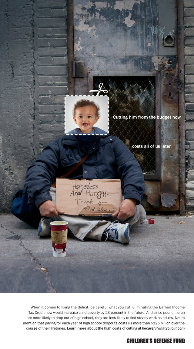
The second case study I wanted to talk about is this one for the Children’s Defense Fund. This is a campaign to help prevent adulthood unemployment and jail time through helping children from the beginning. This is a great social problem that needs more attention because there is an attitude in America of pull yourself up, but this is a challenge if your starting place is terrible. A problem cannot be fixed if the focus is placed on the end of the line, but rather at the beginning. This project takes an aim to fix budget cutes that effect children being born into poverty.
October 2011 held a congressional hearing on what budget cuts were to be made, and childcare, education, and health care were early targets rather than defense budgets. This project was aimed at swaying minds and votes in this decision of what budgets to cut, making the point that children in bad situations do not grow up to be successful adults, generally. They did research and found that in order to make an impact of the reader, they needed financial reasons as well as emotional reasons. After making this assessment of their information, they came up with the idea that juxtaposing a child’s head over the body of an adult in hard time with financial information underneath was a great system and a way to connect right to the emotions of a person. Everyone can connect with these promotional pieces because we were all children at some point. And it further emphasized that all of these people in less fortunate situations than us are still people that came from a baby, like all of us. They used people as the center of their idea, and that really makes an impact and impression.
The designers used the terminology and turned it around to work for them. They were facing budget cuts, and they used the cut as visual language of cut out baby head pictures and placed over the body of someone on hard times. This emphasis of cut made me way more aware of the impacts of budget cuts; if the childcare budget gets cut, then that baby literally gets cut from a good potential life to one that is of struggle and poverty. And then these were sent around social media to spread awareness.
I think this is a successful way of showing potential harms of a policy decision, by actually showing you a potential timeline of a life in one picture. The juxtaposition is well done and the cutting visual language emphasizes the actual cutting happening that affects children’s lives and upbringing. They also added that a cut from someones life in the early years, affects them forever, but also the rest of us in the country. We all need to take care of each other.
Growing up, my parents and some friends would say stuff like “you’re such a creative type” and “I don’t know how you do things like that.” I never knew what to say in those moments, but going back I would now say that they also can do it they just haven’t sat down and tried that hard. Sure, there’s a small bit of natural talent incorporated, but being interested and finding answers is a natural human trait. Embracing this way of thinking can be utilized to create better and more useful things.
Design thinking was somewhat recently defined, but has been used for years before the label. This is the way a problem is treated through a process of thinking and stages. The designer, after receiving a design problem, much start with empathizing with who they are designing for, or the audience. How could I make something for someone in Japan if I have never even been to Japan, for a simple example. Seeing the problem from the perspective of the audience or user is important, and the center of the human centered design thinking. Designing for people rather than corporations or algorithms is where great and useful ideas are born.
After the starting point of learning the problem and who this problem affects, the design can define the problem more narrowly and take that into the ideation stage. The empathize stage is definitely important, but I think the ideation stage sort of gets rushed over when we talk about design thinking. To get to a really great idea, sketching too much and coming up with too many ideas is the better way of designing. From too many ideas, the really strong ones stick out and can be elevated to another level through adding pieces of other ideas, in a mix and match type method. Early in school I would sketch a little and find an idea I liked and then just went fully down that road, rather than fully flushing out all the ideas I had or could have had. In this internship I am in currently, I first came to him with sketches of this and that to see what stood out to him, rather than just show him one idea and hoping he also liked it.
Beyond everything, design thinking is the all around process that every designer should be taking advantage of. We are all trained in the technical side of design and can pick the right pair of fonts, but not all designers do the heavy research and numerous sketches. Implementing that and also obtaining a perspective from the user’s side are all important pieces to the design process that lead to life changing work.
Brown, Tim, and Jocelyn Wyatt. “Design Thinking For Social Innovation.” Stanford Social Innovation Review, 2010, ssir.org/images/articles/2010WI_Features_WyattBrown_New.pdf.




 ART4899