
https://www.aiga.org/case-study-nothing

The first case I wanted to talk about was this one about nothing. The food bank in Rhode Island was overwhelmed and needed a new and fresh way to ask people to donate to those in need, especially food. Having something to eat is one of the basic human needs, and this project was relevant to that problem and could be effective throughout more groups in need of something to eat. This project used the idea that there was nothing to be done about a problem as the main way to create awareness, in a very clever way.
The group behind this used design thinking systems effectively to create the final out come. The article says they thought a lot about ways that were already used to bring awareness and were noticing that the sad tv commercial spots and websites were not working anymore. Based on this idea, they went and actually met with food bank workers in order to see what would actually help them, the people giving the food out. Through going to soups kitchens and connecting with people, they discovered that guilt was a poor way of gaining aid. From that idea, they transformed the tired begging method into an option that would sit right in the store like a product. This is hard to avoid and brings awareness in a clever way, and not a guilty way.
The design team took the idea that there was nothing to be done to help these hungry people, and turned that into a marketing plan. They took their design skills and made a branding system for “nothing.” These empty cans were a literal product someone could buy to help someone in need, rather than sending money to a company that may help. By purchasing an empty can, someone hungry would get something to eat. The packaging fit the norms of food packaging, like the type is inviting and warm and the colors resemble canned food.
This is a great idea, and they achieved awareness through practical means. Eventually this idea got on websites and the news, but the initial idea was not to go straight to an app or website platform, like we might do in today’s world. They did an excellent job.
*********************************************
https://www.aiga.org/case-study-be-careful-what-you-cut
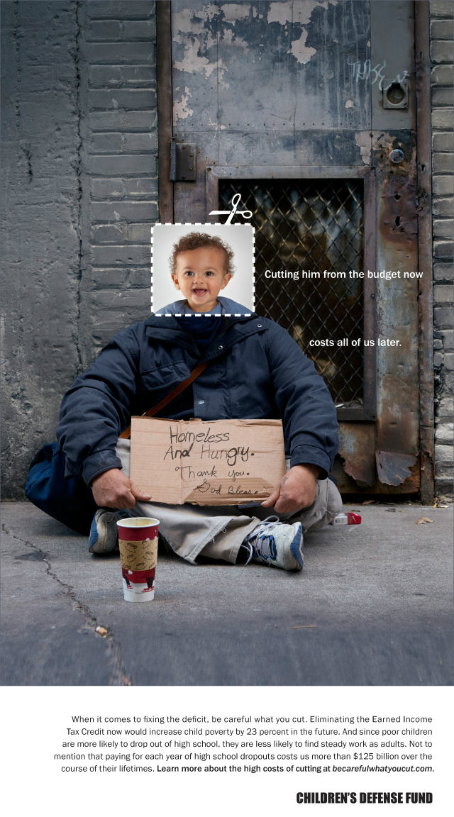
The second case study I wanted to talk about is this one for the Children’s Defense Fund. This is a campaign to help prevent adulthood unemployment and jail time through helping children from the beginning. This is a great social problem that needs more attention because there is an attitude in America of pull yourself up, but this is a challenge if your starting place is terrible. A problem cannot be fixed if the focus is placed on the end of the line, but rather at the beginning. This project takes an aim to fix budget cutes that effect children being born into poverty.
October 2011 held a congressional hearing on what budget cuts were to be made, and childcare, education, and health care were early targets rather than defense budgets. This project was aimed at swaying minds and votes in this decision of what budgets to cut, making the point that children in bad situations do not grow up to be successful adults, generally. They did research and found that in order to make an impact of the reader, they needed financial reasons as well as emotional reasons. After making this assessment of their information, they came up with the idea that juxtaposing a child’s head over the body of an adult in hard time with financial information underneath was a great system and a way to connect right to the emotions of a person. Everyone can connect with these promotional pieces because we were all children at some point. And it further emphasized that all of these people in less fortunate situations than us are still people that came from a baby, like all of us. They used people as the center of their idea, and that really makes an impact and impression.
The designers used the terminology and turned it around to work for them. They were facing budget cuts, and they used the cut as visual language of cut out baby head pictures and placed over the body of someone on hard times. This emphasis of cut made me way more aware of the impacts of budget cuts; if the childcare budget gets cut, then that baby literally gets cut from a good potential life to one that is of struggle and poverty. And then these were sent around social media to spread awareness.
I think this is a successful way of showing potential harms of a policy decision, by actually showing you a potential timeline of a life in one picture. The juxtaposition is well done and the cutting visual language emphasizes the actual cutting happening that affects children’s lives and upbringing. They also added that a cut from someones life in the early years, affects them forever, but also the rest of us in the country. We all need to take care of each other.
*******************************
SOURCES:
Case study by Fallon March 18, Fallon. “Case Study: Be Careful What You Cut.” AIGA, 2013, http://www.aiga.org/case-study-be-careful-what-you-cut.
Case study by Nail Communications November 13, Nail Communications. “Case Study: Nothing.” AIGA, 2013, http://www.aiga.org/case-study-nothing.

